Creating and design a successful eCommerce website requires proper design to improve user experience and encourage them to place their orders quickly. Studies show that 76% of customers consider ease of use as the most important feature of an online store.
The purpose of website design and eCommerce page optimization is to help buyers get what they want faster and help them purchase their products without unnecessary complications. Online sellers only have a few minutes or seconds to convince users and sell their products. Therefore, they should improve the user experience by considering features on their store page design, such as product categories, filters, and comparability, to simplify the order process in online stores as much as possible.
In this article, we will introduce you to the five essential tips you should keep in mind to make your online store more user-friendly, as well as a plugin that you can use to optimize the design of your eCommerce page according to your customer’s tastes.
1. Optimize the design of the eCommerce website
The design and interface of your eCommerce page and the information it contains have a huge impact on whether your customers buy your products or not, and it also affects your site’s SEO in search engines like Google or Bing.
If analytical results of your store page reveal that customers leave the site quickly after landing, it means you need to spend some time improving your eCommerce page design.
The optimal design of the store page will satisfy the customer by providing some practical features such as filtering the desired products and finding the add-to-cart button quickly.
The design, layout, images, and content used on this page impact customer behavior, so the more user-friendly interface you can make for your customers, the more orders you can receive, which result in experiencing an increase in eCommerce sale.
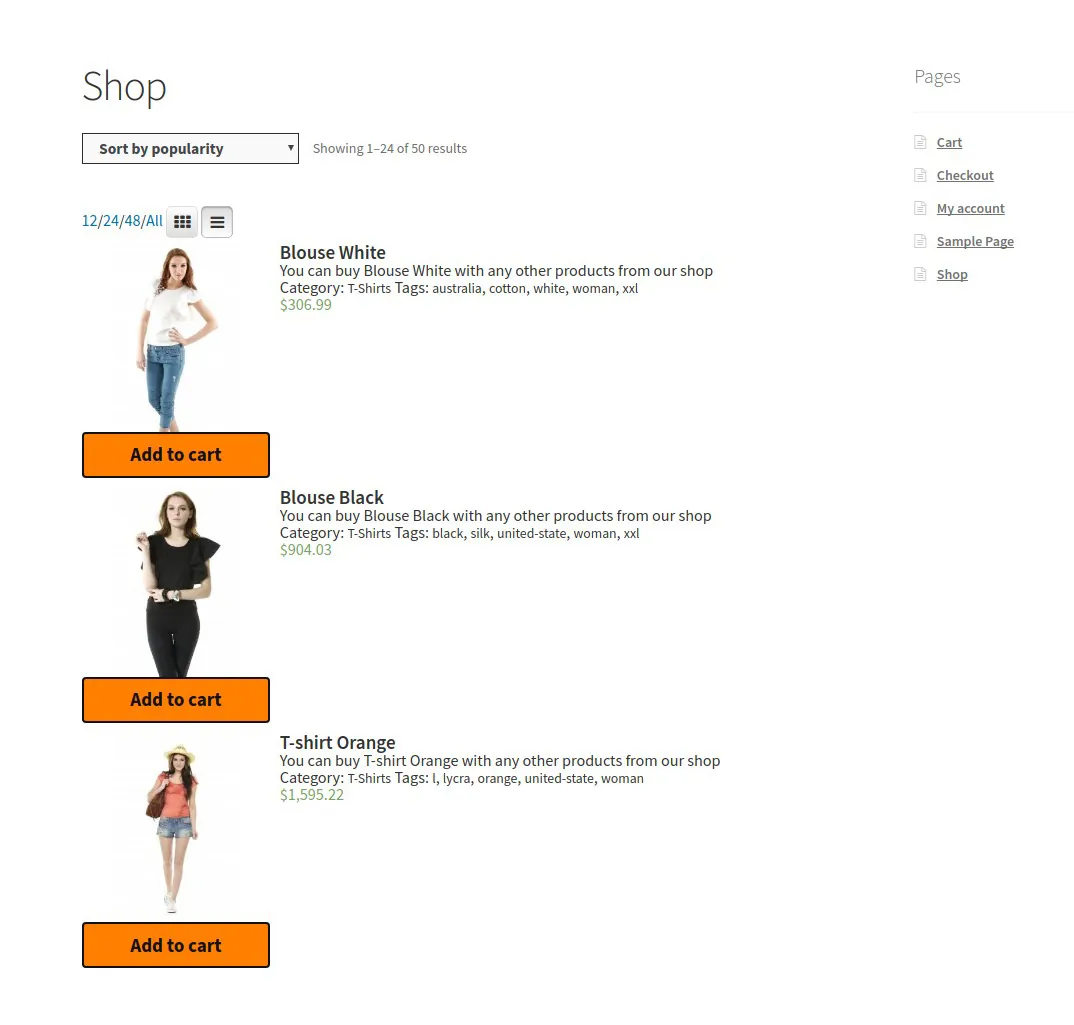
The store page displays products in three modes:
- List mode: In the list mode, each product is displayed in a single row containing details such as the title, product description, and image.
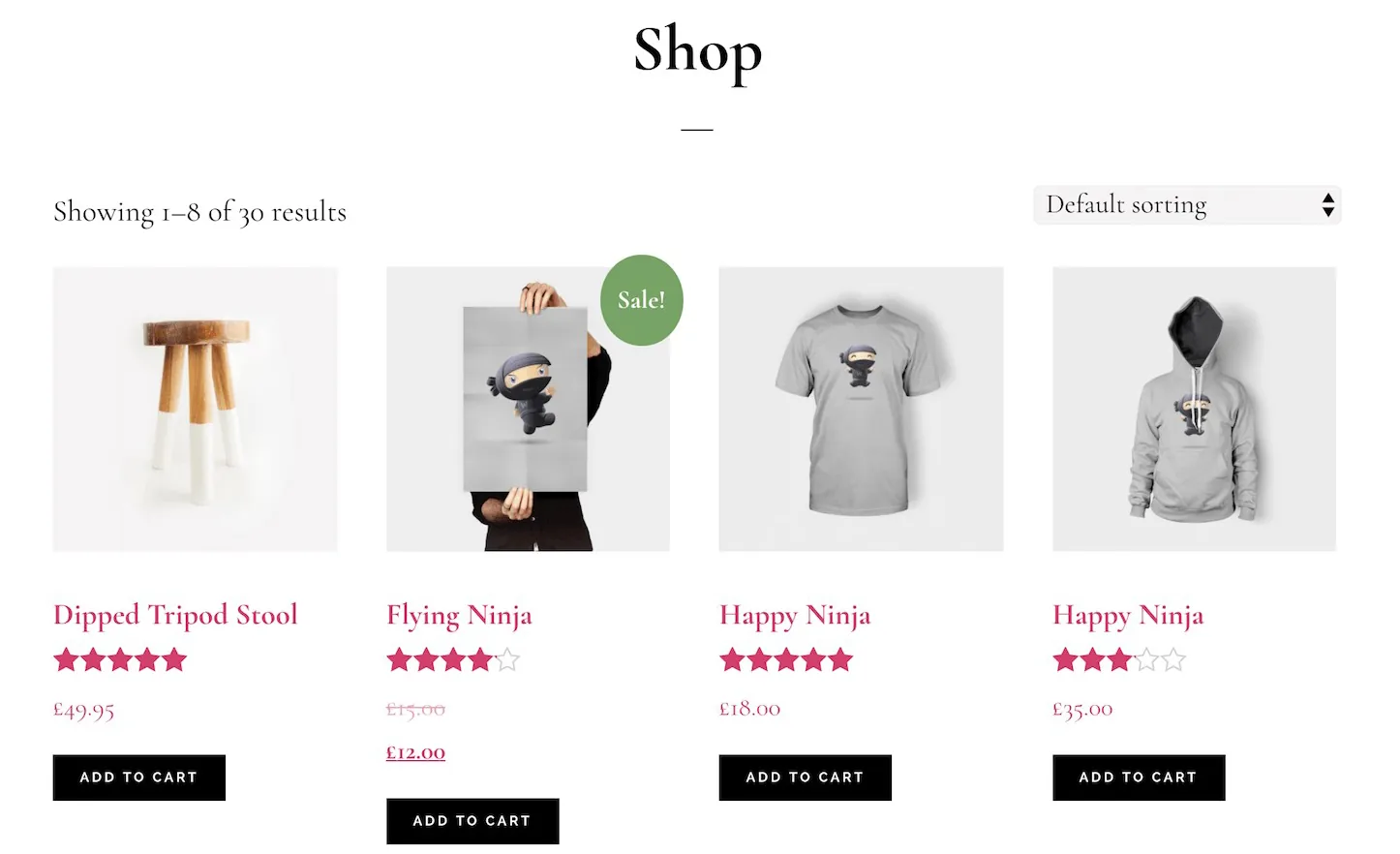
- Grid Mode: In grid mode, additional details are hidden, and products are placed next to each other in several rows and columns, which usually display a thumbnail image, title, and product price.
- Table Mode: Statistics show that the best design for store pages is in the form of a table, which allows the customer to view all products with their main features, including price, categories, taxonomies, quantity, variations, and add to cart button on one page.
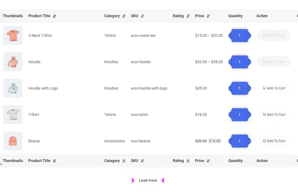
Display all products on table view using the WooCommerce product table plugin
With the help of the WooCommerce Product Table plugin, even if you have hundreds of products in your online store, you can easily display them on a table. Also, Customize the table columns based on product specifications, and make the customer scroll to load more products. Apply filters that irrelevant products are not displayed.
As we mentioned above, displaying products in a table view is the most user-friendly interface that can improve customer experience and help eCommerce websites increase sales.
2. Show the price and specifications of simple and variable products to the customer
One of the most important features of the design eCommerce page is displaying the price and product specifications on the store page. It is better to display a list of products with their important features so that the users do not need to click on each product every time to see its features and price.
Regular and sale price, product category, short description, color, size, and brand are among the essential features you need to display to your customers in the product table. However, the specifications displayed in the product table will differ depending on the products you sell.
With the WooCommerce product table plugin, you can show simple and variable products with their specifications in a table view.
It is also possible to add all the default and custom fields you created in WooCommerce as product table columns and show them to your customers on the store page.
As you can see in the below picture, on the “Columns” tab, you can select the columns of the table and, to design a responsive site that can be displayed well on all devices, determine which columns should be displayed on each device.
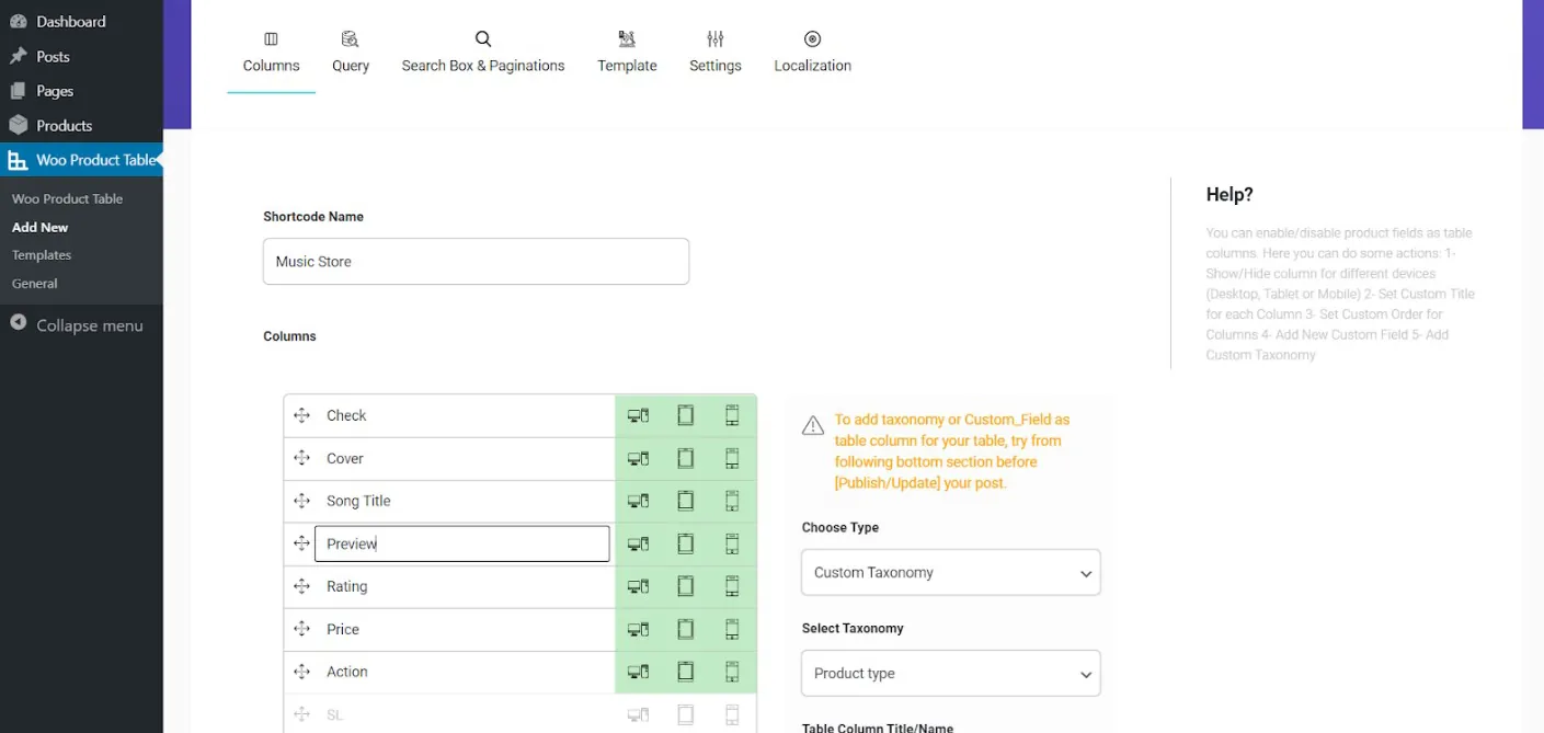
Shop page design of simple products
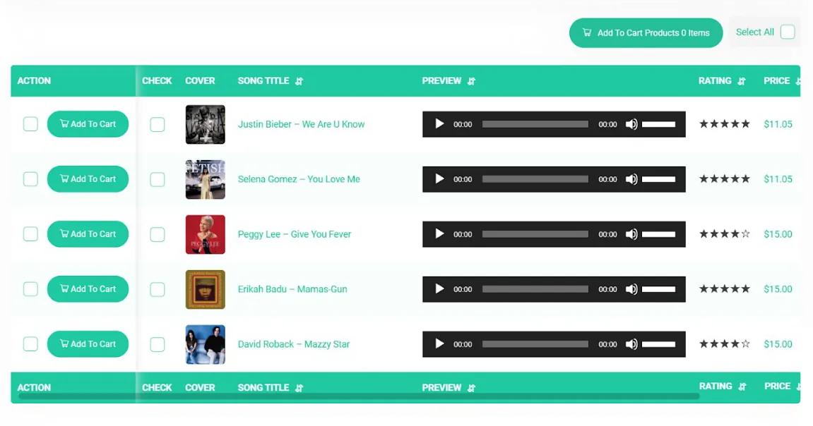
Suppose you intend to design a store page to sell music and albums. The most important features customers expect to see on your store page include music album cover, artist name, album name, preview, rating stars from other users, and song or music album price.
In the image below, you can see that all the selected columns are displayed on the store page after saving on the Columns page of this plugin:
Design an eCommerce website with the possibility of increasing or decreasing the quantity of products
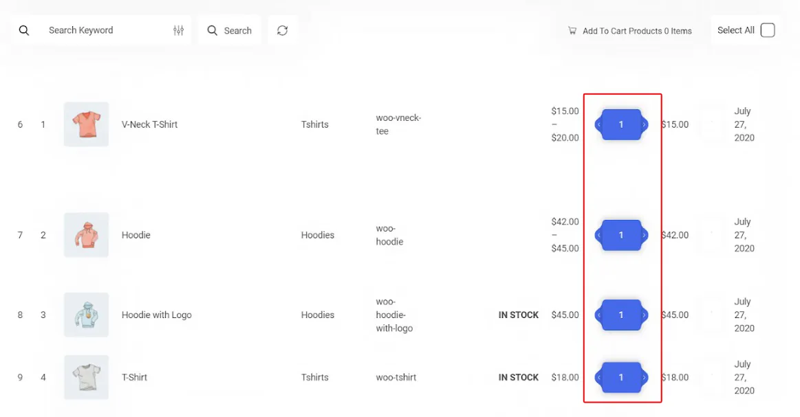
Suppose your products are such that the customer can order a large number of each product. In that case, you can provide them with the possibility to increase or decrease the desired qty directly from the product table by adding the quantity column. In this way, the customer does not need to enter the page of each product and choose the quantity he wants.
Design store page of variable products
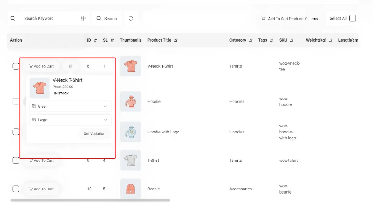
One of the most important tips that will help increase your sales is to display product variations on the store page and allow the customer to choose them directly from the product table. By installing the WooCommerce Product Table plugin, you can add the “Action” column to the product table and provide the customer with the opportunity to see all the variations of a product on the same page and see the price of each variation as well.
3. Make it easy for customers to search and filter products
Displaying the search bar at the top of the store page so that the customer can see the results after searching for the product and, if necessary, can make a change in the searched term, simplify the purchase process for the customer and help increase the sales of your online store.
By adding the possibility of advanced search and product filtering, you can also provide conditions for users to choose the price, size, color, model, and other product features and achieve their desired result in the shortest possible time.
Designing a store with search and filtering options will significantly increase your profits and improve the customer experience.
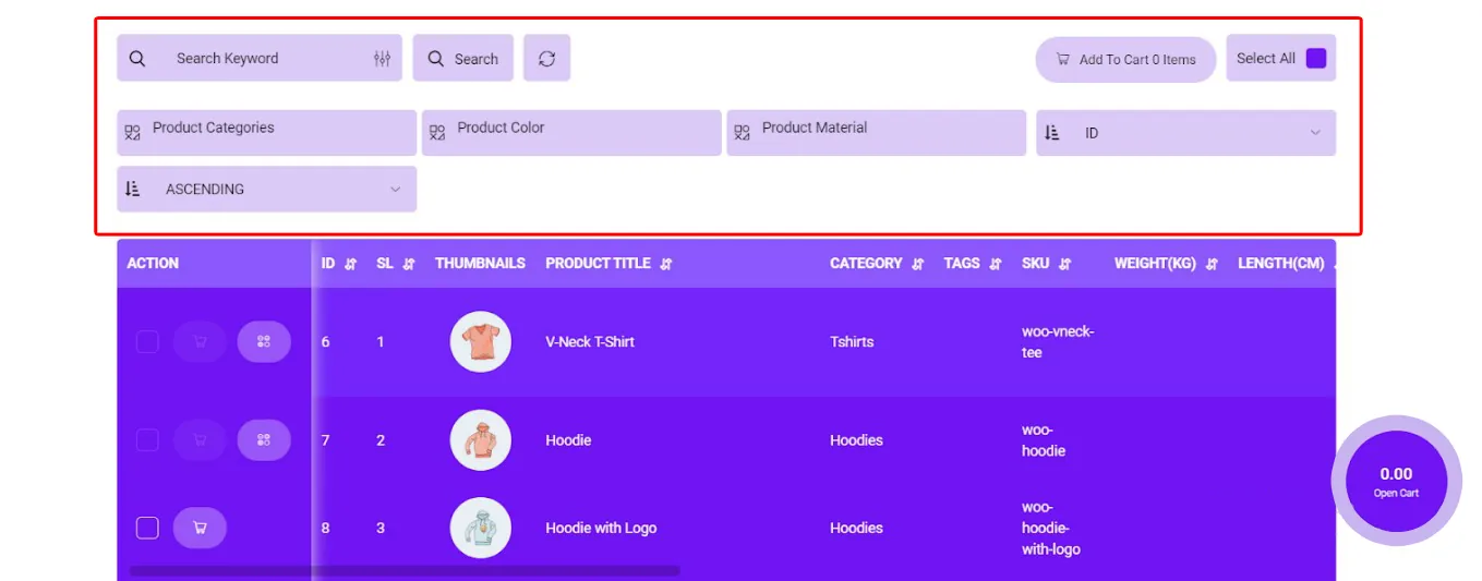
By installing the WooCommerce Product Table plugin, you can enable advanced search in your online store and activate the search bar in the settings section to display it to the customer at the top of the product table.
As you can see in the image below, in addition to the search bar, any filtering can be added to the top of the table so that the customer can filter the products they need based on their desired features.
4. Show special offers in the design of the eCommerce website checkout page
Store sites use special offers for marketing and sales regularly. These Promotions can include a discount on the product price or a free gift product offer with different strategies that motivate customers to make more purchases from the site or visit certain products for which a special offer is offered.
Choosing a strategy for providing special offers to customers depends on the site manager and the marketing team. But the most critical issue is how to display it on the site.
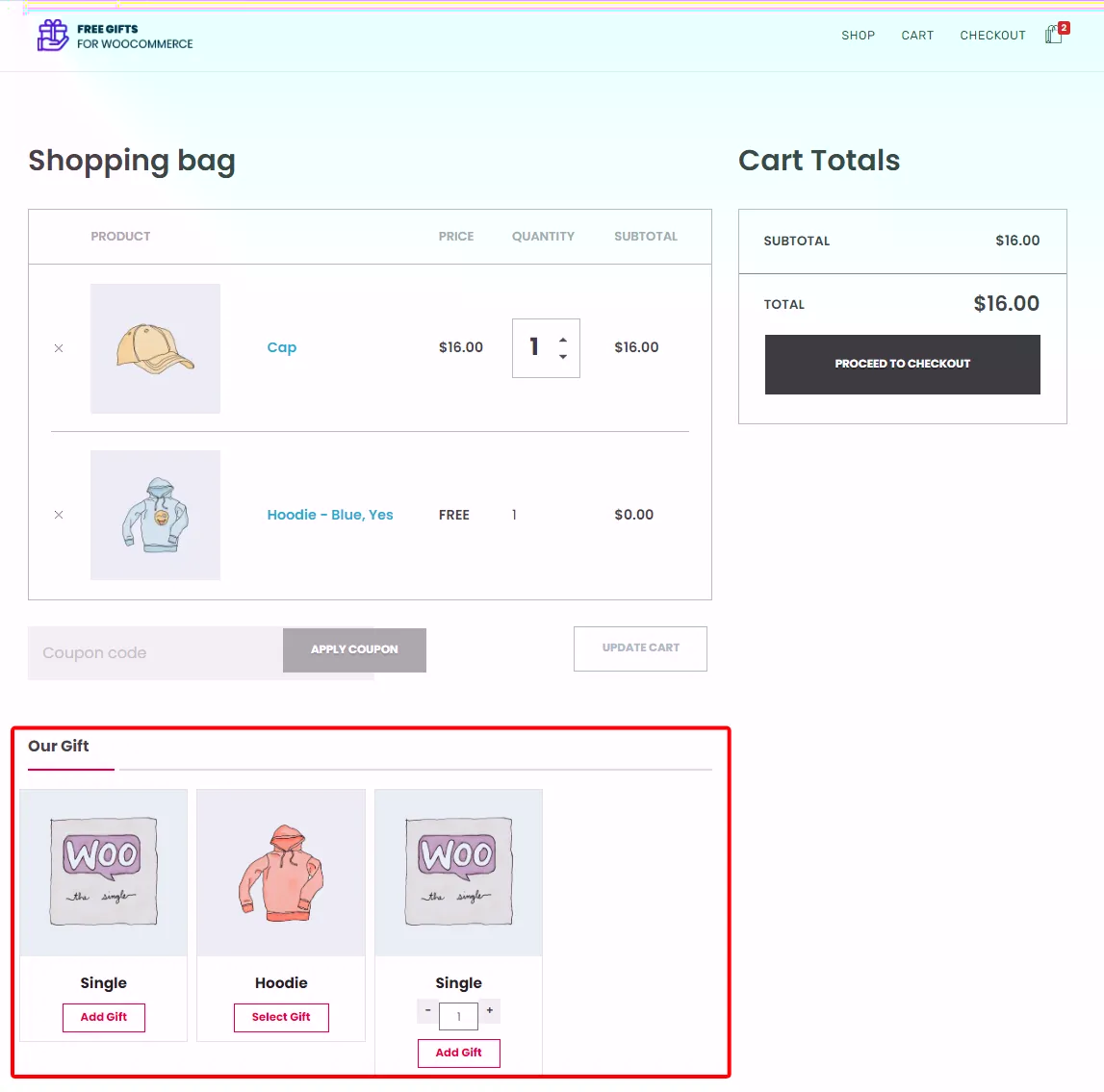
For example, the site manager can display a list of free gift products on special occasions such as Thanksgiving or Christmas on the checkout page to take the design of this page to the next level and invite customers to receive gifts by purchasing more products.
Although WooCommerce makes it possible to add a discount code to your eCommerce store, it is not possible to offer a free gift product without using the free gifts for WooCommerce plugin on WooCommerce websites.
With the help of the free gifts for WooCommerce plugin, implement various strategies for your marketing
The Free Gift for WooCommerce plugin allows store managers to implement marketing strategies to increase eCommerce sales. With this plugin, it is possible to create rules with different methods and various restrictions and conditions depending on the needs of the site managers.
For example, if the site managers wants to offer a gift product on one of their products with “Buy one Get one” strategy, it is possible in the following four simple steps:
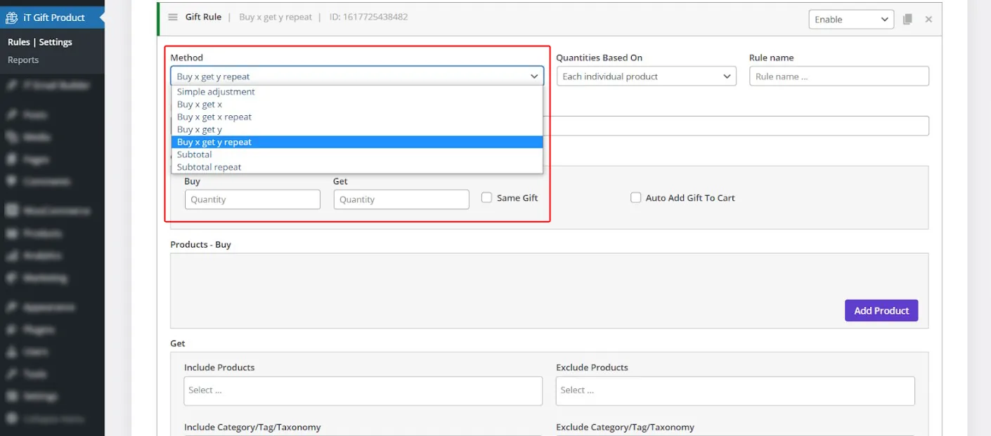
- Choosing the Buy x Get x method.
- Enter the buy and get qty as one, respectively.
- Select the product in the Buy Products section.
- Add conditions and restrictions in the “Conditions” section.
The manager can apply any condition for the free gift offer in this section. For example, it can make a free gift available to customers on a specific date or offer a special offer only to new customers who purchase this product for the first time, as shown below:
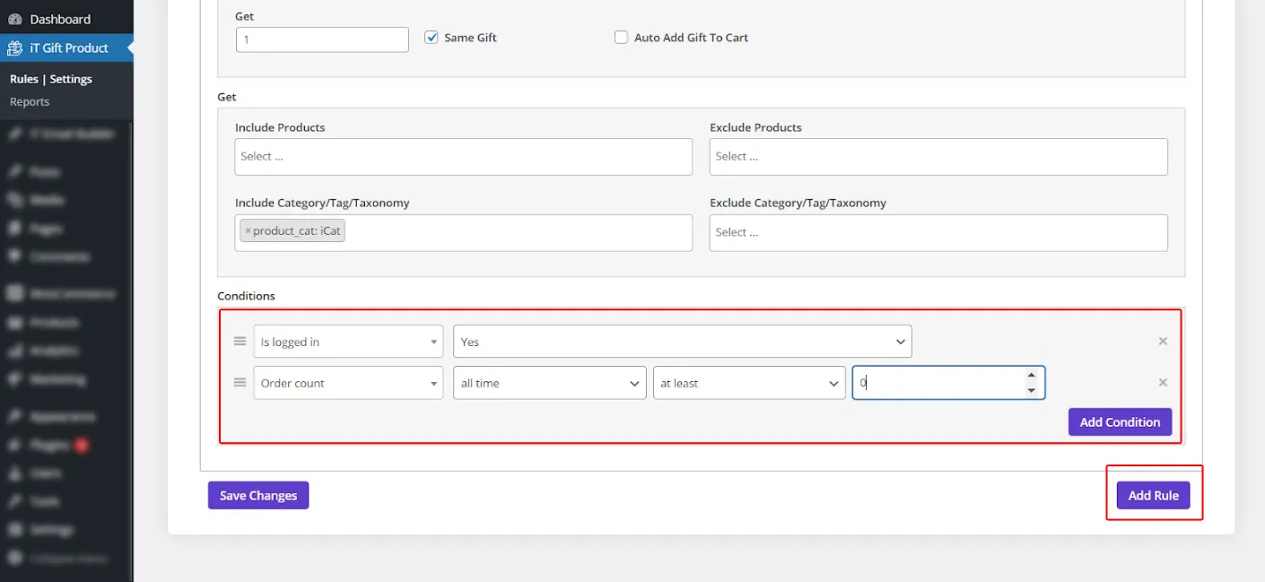
After creating the desired restrictions and clicking on Add Rule, a list of all gifts will be displayed on the checkout page, allowing customers to choose their free gift and add it to their shopping cart.
5. Simplify the “Add to cart” and payment process for the customer
Cash flow is like the blood for our body that keeps an online store alive. If customers don’t buy from your online store, you won’t last long in eCommerce. The worst thing that can happen is that the customers decide to buy, but because of your website’s complicated purchase and payment process, they get disappointed and leave your online store.
As an eCommerce website, you need to solve these problems by improving the user interface and simplifying the design of the store page to help customers feel comfortable when trying to place an order.
Adding an “add to cart” option on the store page in front of each simple and variable product is an essential feature for increasing eCommerce sales on online stores.
Pay attention to the ease of use the Amazon site provides for their customers, so they need just one click to buy. On Amazon, Buyers with registered accounts can make purchases with just a click on a button.
If your website has a complicated order and payment process, the customer will quickly get tired of shopping and leave your site.
Online buyers are usually aware of technology and desire online payment methods, speeding up the purchase and payment process and increasing customers’ trust in the store. In addition to improving the user experience, it also increases your conversion rate and sales.
Customize the purchase and payment process for your customers with the help of the WooCommerce Product Table plugin
One of the most compelling features of the WooCommerce product table plugin is that you can display the “add to cart” option to customers as a sticky bar on the left or right side of the product table on the store page.
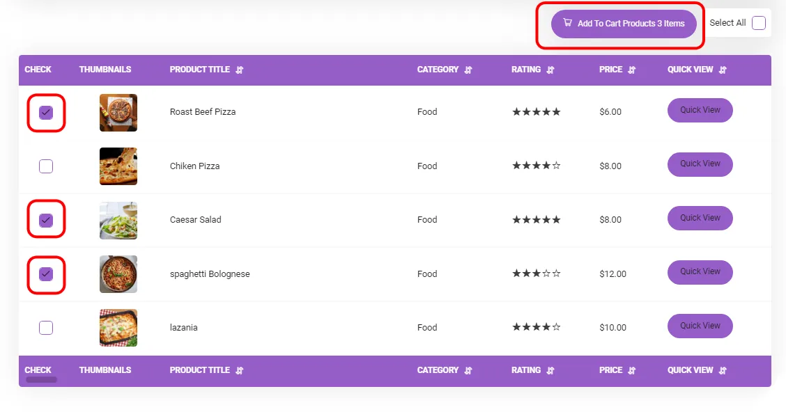
Among the other features that this plugin provides for easier and faster shopping for customers is the possibility of increasing or decreasing the quantity of products and adding several products to the shopping cart simultaneously, which is not possible by default on the WooCommerce store page.
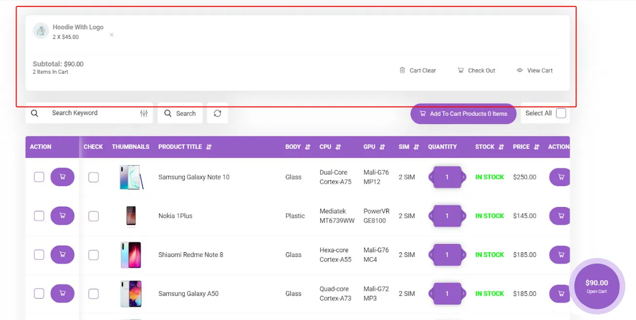
You can display the shopping cart option on the top of the table or as a sticky on the store page that show the subtotal amount and number of items added to the cart, as illustrated below.
Conclusion
In this article, we share some tips and tricks with you to create an eCommerce store with a user-friendly design that can result in improving your customer experience and boosting your sales. We hope that following these tips in your business will improve your website traffic and have a higher income. You can also use the WooCommerce Product Table and Free Gifts for WooCommerce plugins to take your eCommerce website design to the next level.
